When I say "city", what image pops into your mind? How would you visualize a city?
Are they images that look a bit like these?
 |
| Montréal from Mont Royal |
 |
| Chicago's downtown in Google Earth |
 |
| Tokyo from the observatory of Roppongi hills |
Well, if this is the case, you may be suffering from modelitis.
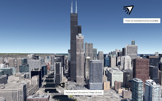
What is modelitis? Well, modelitis is when people judge a city's look based on how it looks as a model or as seen from afar, rather than how it looks from the city itself.
The issue is a matter of point of view. Too often, people (often planners and architects) seem to care about a certain point of view of cities that city residents and workers do not regularly, or ever, have. When you make the model of a city, you tend to look down at it. It can be useful in that it allows people to look at a city as a whole, but that point of view is largely meaningless as few people can "enjoy" it.
 |
| Which point of view should be favored? |
Who has that point of view in real-life? Well, birds, for one. The tiny minority who has the chance of having top-floor offices with windows or apartments in skyscrapers. People flying inside helicopters or planes. And... that's pretty much it.
Is this really the objective? To design cities so that birds will find them attractive? Meanwhile, the vast majority of people who live, work or shop in cities view cities from the ground, or from windows often no more than 4 or 5 stories up. THIS is the point of view that is important, but it is too often ignored by planners and architects used to make their decisions based on models or computer simulations that tend to favor this bird's eye view.
Why is there a focus on the bird's eye view?
I think the main reason is simple: in previous eras, the ability to visualize a city from the sky was very limited, if not completely absent. Likewise, knowledge was more technical than theoretical, so even when builders wanted to beautify buildings, in general this was done with a focus on the point of view they had as they were building them.
 |
| Old buildings in Clermont-Ferrand, note the attention to details on the windows, the cornice, etc... |
 |
| A church in France, again, note the attention to details, especially on the gate |
In previous eras, there was no distinction between architect and engineer, those who designed buildings also directly oversaw their construction. Architecture was a very hands-on profession. But in the modern era, architects work mainly with paper, models and computer simulations. Those who end up overseeing the construction of what they design are engineers, and finally, those who actually build the building are laborers who have zero input in the design of anything. Which means that all the authority for design decisions has migrated far away from the actual building, the point of view of the designer is thus completely different from that of the people who will actually use the building or reside near it.
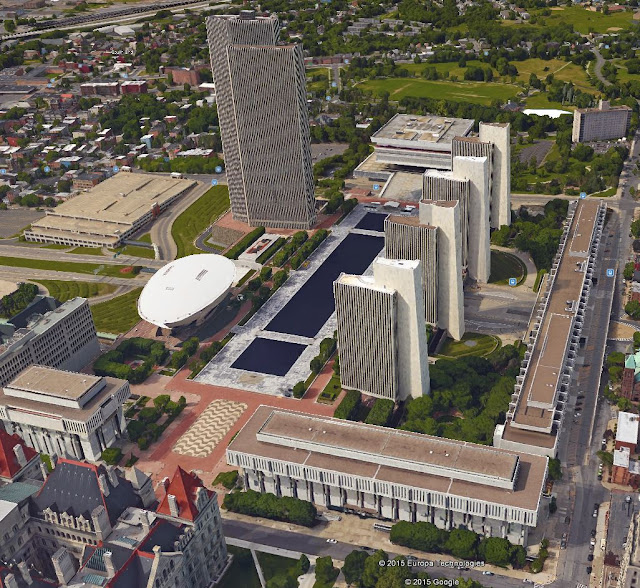
The apotheosis of this is brutalist architecture, where buildings are made of concrete, lacking fine details, but emphasizing their shape instead.
 |
| Empire State Plaza in Albany is a brutalist masterpiece, it looks awesome from the sky |
 |
| But it absolutely lacks in details for pedestrians up close, the only reason you would be near these buildings is if you were on the way in or out |
So architects are now completely divorced from the point of view of the users of what they design, they instead are focused on their models and their simulations which gives them a bird's eye view of their buildings. As they're not incompetent, they make the buildings look good, but they look good from THEIR point of view. And thus, we have "modelitis".
Effects of modelitis
Modelitis infects more than just architects, planners are also affected by that perversion of focusing on the wrong perspective.
This makes planners adopt regulations that prioritize a perspective that should not be prioritized, meaning the bird's eye view or the skyline view (which is only visible from afar, and thus, not from the city itself).
The irony is that even urbanists who rebel against brutalism often articulated their criticism from the perspective of a model: versus the modernist skyscraper, they opposed a strict height-limited city, supposedly to preserve the "human scale". That criticism is also steeped in modelitis because it still focuses on the vertical scale and on uniformity as seen from afar. Someone who sees cities from the point of view of a pedestrian knows that the human scale is horizontal, not vertical. Meaning that the height of buildings isn't that relevant to human scale, what matters is how wide they are and their proximity to one another.
This focus on verticality is a clear effect of modelitis, higher stories are usually not visible from the ground for pedestrians. Even when they are, people tend to look down, not up, so most people will not even notice how tall buildings really are unless they take the time to check. A focus on a proper point of view, one of pedestrians, would focus on how a building's 3 or 4 lowest stories meet the street, not on how high it is, ESPECIALLY when the sidewalks have awnings, in which case the buildings are largely not even visible!
 |
| At the foot of the Empire State Building, sorry for the windshield perspective, the actual height of the building is irrelevant |
So even if you care about harmony and order in urbanism, you should focus on the harmony and order as seen from the street, not as seen on a model of the city or from the sky. For example, Vancouver has had good urban planners who understood this and allowed skyscrapers that also had podiums that maintained the "street walls".
 |
| "Vancouverism", towers are present without disrupting the "walls" of the street", they are in the background, not the foreground |
 |
| This is the view from the street, again, forgive the windshield perspective |
Modelitis largely forgets the fact that buildings aren't art pieces, they are primarily consumer products, and cities aren't art galleries. It prioritizes the look of a city on a model and not whether or not it fulfills its role in responding to residents' needs and desires. A city which planners suffer from modelitis will keep making decisions based on what looks good, if this happens to satisfy people's needs, it will only do so by luck, not by design. Worse, the point of view that is prioritized is one that few if any people have, so even though the city's development is shaped by aesthetic preoccupations, it may not even look good for the residents who may be faced by wind-swept plaza, blank walls and boring streets... but hey, if they take an helicopter ride, what a view they'll have!
Modelitis applied on an urban park: Square Viger in Montréal
Square Viger in Montréal is an example, I think, of modelitis applied on the design of an urban park. It is highly controversial and the current mayor thinks of simply having it redone from the ground up.
Here is what it looks like from a bird's eye perspective:
So from the sky, it offers a lot of patterns which don't look too bad. Rather than a flat surface, there are different landings separated by small flights of stairs.
However, here is what it looks like from the point of view of people walking on the sidewalk:
This is extremely non-welcoming, and as a result, the square is deserted, apart from the homeless, drug addicts and drug dealers. Let's count down the elements that make it unfriendly to people.
- All in concrete. There are a few trees and plants put on the concrete structures, but they have low visibility and, in the case of the plants, basically invisible when people are under these structures
- Right angles everywhere which increases the unorganic nature of the concrete.
- Too many stairs. Stairs are not a pleasant place to walk in, so they should be avoided where possible. They are hard on the knees, slow down travel and are a safety risk. Dividing the square needlessly into several landings separated by small stairways was a huge mistake.
- Too many blind spots. The concrete structures and small walls result in many places being hidden from the street or from the rest of the square, this creates a feeling of insecurity as who knows who can be hidden there, especially when one knows the usual "population" that hangs around the place.
As a result, it is an unmitigated disaster, no one goes there if they can avoid it. Local residents will even make detours to avoid it, even if it is the shortest path to their destination.
Yet, architects and the artist community still defend the square. They swear the design is good and part of Montréal's heritage. Basically, they're saying that the problem is the public who is not "educated" enough to enjoy the Square. Again, this comes back to the problem of seeing urban developments as art rather than as consumer products. On an artistic model, this may be a good design, but a Square is meant to be a public place that welcomes people to it and invite them to relax inside. In this case, the judgment of the "consumers" is clear: it is a total failure.
Conclusion
So, to sum up, it is crucial when judging cities to judge them from the point of view that matters, that of pedestrians or of residents looking out their windows. Too many people favor a bird's eye view of cities, or one from afar (skyline) that is not relevant to the actual people who live, work and shop inside cities. This results in misguided rules that ultimately hurt a city's potential at fulfilling its primary role of providing a good place to live and in which economical, cultural and social activities may occur.
Finally, I think that we must keep in mind three things:
- The human scale is horizontal, not vertical: human beings do not usually look up, so the actual height of buildings is not that relevant, but distances that are too great between locations tend to discourage people from exploring areas and from walking from one place to another and so destroys the strength of urban areas.
- Buildings are first and foremost consumer products: buildings exist to provide locations where people may live or where economical, cultural and/or social activities may occur. This is why they exist and their primary function. Aesthetic considerations are not meaningless, but they should be a secondary preoccupation. Sacrificing function to protect a desired form is a perversion of architecture, that should always put the human being, his needs and his desires, at the center of its process.
- A pedestrian-friendly design should focus on detail, not shape: buildings in many, if not most, highly attractive places are often basically simple boxes, but they compensate by focusing on the details of wall, windows and doors to provide things to look at when people are up close. The form of buildings can only ever be glimpsed by looking at a distance, and often only by looking at it from the sky.


